
EXPERIMENT / Working demo
Building an interactive clothing rail in WooCommerce
Inspired by Cambree Bernkopf’s interactive clothing rail, I built a WooCommerce experiment where visitors can browse garments, inspect a shirt, choose a size and colour, and add that exact variation to their cart. I used Codex to help develop and refine the experience in WordPress and Elementor.
Try the live experimentInspired by Cambree Bernkopf’s interactive clothing rail.
The goal
The experience needed to feel like browsing a clothing rail while staying connected to a WooCommerce store. Beyond moving a 3D shirt, the selected size and colour had to match a real product variation, with the correct price and stock status. The interface also needed to work on smaller screens.
I kept the 3D scene, interface and store connection separate so I could refine the visual experience while WooCommerce controlled the product data and cart.
What each technology did
- WordPress + Elementor
- The editable page, with the rail built directly in an HTML widget.
- HTML + CSS + JavaScript
- The interface, responsive layout, interactions and API requests.
- Three.js
- The 3D rack, garments, materials, lighting and movement.
- WooCommerce + Store API
- Product variations, server-confirmed prices, stock status and cart actions.
- Codex
- Development assistance during implementation and testing.
How I built it
01. Define the browsing journey
I mapped out the journey: browse the collection, inspect a garment and return to the rail. Visitors can browse by dragging, using the previous and next buttons, or choosing a colour dot. A visible “Back to the rail” control closes the detail view.
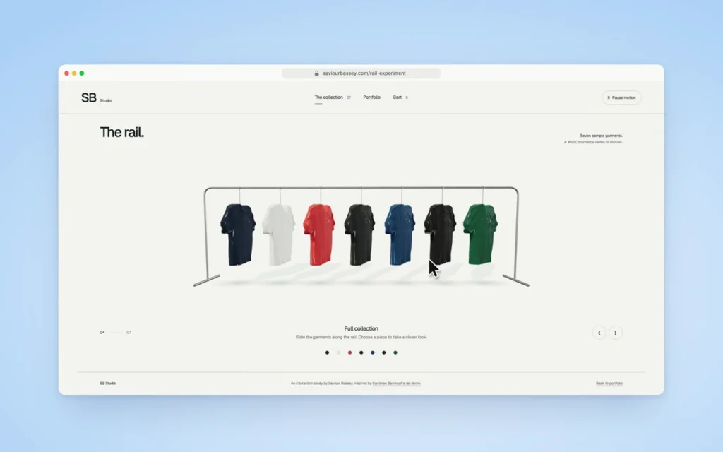
02. Build directly inside Elementor
I built the experiment in a full-width Elementor container, using one HTML widget for the markup, scoped CSS and bundled JavaScript. This keeps the rail directly editable on the page in Elementor. WordPress hosts the page, while custom code provides the interactions beyond standard page-builder widgets.
03. Construct the rack and garments
Three.js renders the metal stand, hangers and seven garment shapes. Textures, folds, lighting and shadows give the shirts depth. I adjusted the hanger positions and the way each shirt sits across its hanger so the clothes look properly supported. The garment previews use procedural geometry, controlled deformation and sway to suggest fabric movement.
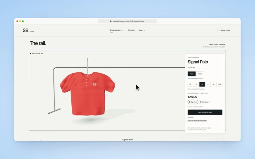
04. Keep the stand fixed
An early version moved the entire rack when browsing. I changed the movement so the stand stays fixed and only the clothes slide along the bar. The garments gather towards the ends without changing order, and their hangers stay on the bar. Dragging and the navigation buttons use the same movement limits, preventing visitors from browsing past either end of the collection.
05. Make inspection useful
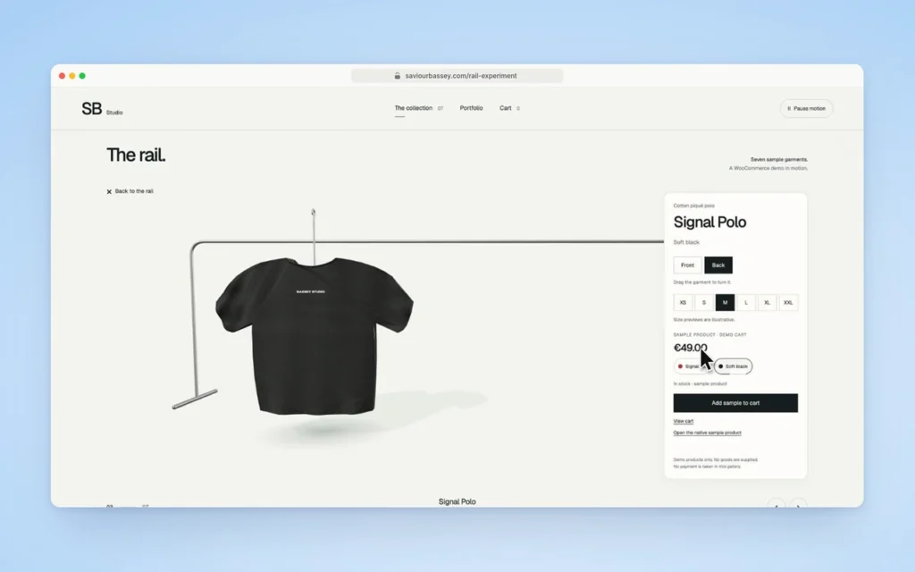
Selecting a garment brings it forward and opens a separate product details card. Visitors can drag the shirt to rotate it or use the Front and Back buttons. Colour choices update the preview, while size changes provide an illustrative fit preview. A warm white background keeps the controls readable. On phones, the card sits below the garment.
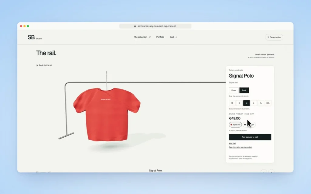
06. Create the WooCommerce catalogue
I created seven sample variable products in WooCommerce, each with six sizes and two colours, giving 84 variations in total. Each combination has its own SKU and stock status. Including an unavailable combination let me check that the interface showed a sold-out state instead of treating every visual option as purchasable.
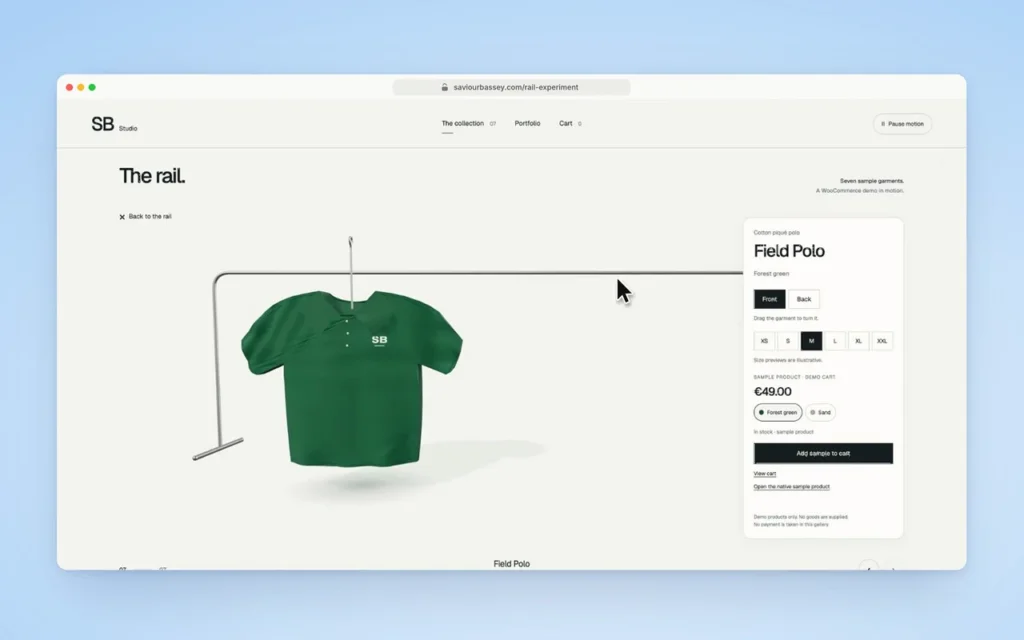
07. Connect selections to the cart
The Store API supplies the product and variation data. The selected size and colour must match an exact variation before the Add to cart button becomes available. Prices and stock status come from WooCommerce. Cart requests use the browser’s WooCommerce session, refresh security tokens when needed and guard against repeated clicks. The interface checks the cart response before confirming that the item was added.
08. Adapt for mobile and accessibility
On phones, a static preview appears before visitors choose to activate 3D. I capped the rendering resolution, simplified mobile shadows and paused rendering when the scene is offscreen. Keyboard navigation, reduced-motion support, a pause control and links to the standard product and cart pages provide alternative ways to use the experience. The scene also releases its resources when Elementor rebuilds the widget.
09. Test the complete journey
I tested desktop, tablet and phone layouts, navigation limits, hanger positions, garment inspection, size and colour changes, stock states and cart continuity. I also checked security token refreshes, repeated clicks and network responses that did not clearly confirm a cart update. Finally, I added a sample variation to the standard WooCommerce cart, verified that it matched the selection and removed it. This checked the store connection as well as the 3D interface.
What I learned
What works
The demo connects a custom 3D browsing interface to WooCommerce’s product variations and cart. The stand stays fixed as the garments move, each shirt can be inspected, and the chosen size and colour determine the exact variation added to the cart.
Before using this in a production store
The gallery uses sample products; it does not supply goods or take payments. The garments and size previews are illustrative. For a production store, I would use product-specific assets and carry out further testing across devices, accessibility, performance and the full checkout journey.